Thursday 22 March 2012

How did you use new media technologies in the construction and research, planning and evaluation stages?

I've created a powerpoint presentation showing the different media technologies I've used:


 Throughout the project, I've gained a deeper understanding of the importance of new media technology. Web 2.0 allows people to interact and collaborate with each other in a social media dialogue as creators of user-generated content in a virtual community; it means that consumers are now becoming producers. Examples of Web 2.0 include social networking sites (Facebook, Twitter, etc.), blogs, wikis and video uploading sites (eg. Youtube). New media technologies such as Web 2.0 have allowed me to directly access my audience and connect with a much larger audience, getting instant feedback, which has made me appreciate why a growing number of marketers are using Web 2.0 tools to collaborate with consumers on product development and promotion. Ultimately, Web 2.0 offers an opportunity to engage consumers.

What have you learned from your audience feedback?

Throughout the production of our video, we have continuously learnt from audience feedback, making improvements based on people’s thoughts and ideas. As the target audience for our product is 13-19 year old females, we were able to ask for many of our friends’ opinions which we found encouraging and useful. Once we’d established the genre of our video i.e. romance, we were able to research existing media texts, such as Taylor Swift's 'Mine' music video and Rihanna's 'We found love' music video, and explore what codes and conventions they’d used to appeal to their target audience. We created polls on our blog to find out our target audience's preferences of film and song in the romantic genre, which helped us decide which direction we should take with our video, in terms of song choice and style.

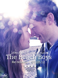
After creating a first draft of each of my ancillaries, I showed my peers the products and asked for their opinions as to which areas needed improving. From this, I found that the fonts needed to be bolder in order to stand out, but overall the feedback gave me confidence in my products.
Before

After
Peer assessment was also useful when it came to editing the final cut of our video - we showed them our first and second rough cut, making improvements each time based on their opinions. After some discussion, it was agreed by everyone that the ending needed to be more definite (we'd previously used a long zoom of the scrapbook, followed by a shot of the sea which faded to black), so we cut the ending earlier, blurring the scrapbook until it faded to black. This was a much more effective ending, as the closing of the book in itself brought the narrative to a definite end.
Before
After
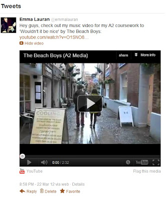
Throughout the project, I have gained much understanding of the importance of audience; I've learnt that a text, in itself, has no meaning until it is read or decoded by an audience. Therefore, it was crucial to continuously ask for feedback from our target audience because their opinions and ideas were key to our video's success. It's also important to harness the power of the social network because it's becoming an extremely useful way of accessing target audience and creating a buzz online proves to be a successful way to market products. I've done this by posting my video on Facebook and Twitter (see below) to make my video accessible to more people and receive their feedback.

Facebook
Twitter
By doing this, I was able to directly access my target audience and get instant feedback. I found that my video appealed to both genders, which has made me re-consider my audience as being both male and female teenagers:

Rach is 17 years old and is a fan of indie music. She enjoys watching music videos and uses Web 2.0 to share and listen to new media. We were able to get instant feedback from her because she watched our video on facebook on her phone on and immediately commented on it with her response. Rach 'favourited' our video on Youtube and added it to her playlist, which proves that she enjoyed our video!
James is a prime example of a male who enjoyed our video. Although he is interested in a different style of music, he still found elements of our video appealing and found that he could relate to our quirky male protagonist very well. James liked the video on Facebook and gave us his feedback in person, saying that he loved the locations used and it had a great narrative.

How effective is the combination of your main product and ancillary tasks?

When creating our ancillaries, we made choices about font, colour and layout based on what resonated well with our video. One font we've used in both our poster and album cover looks as though it's been handwritten, giving it a personal touch, fitting in with our video which also has a personal feel. Furthermore, our album cover ancillary is featured in the video as the front cover of the scrapbook, a key element of our video. I've uploaded both my ancillaries to Flikr and annotated them with notes about why our products link so well, which can be viewed below (click on photo and roll over image to see tags).
Video

Album Cover
Ancillary cd cover
(Click on photo to see tags)

Poster
Ancillary poster
(Click on photo to see tags)

Here's a short video of our target audience watching our video and their feedback on how the ancillaries link together. I asked a selection of people (mixture of ages and genders) what they liked about the video and what they thought worked well. 


As the video demonstrates, our audience were impressed by our products and picked up on key elements that we purposely used to create meaning, such as the blue tones and the scrapbook etc. Therefore, I feel as though we have succeeded in creating a successful video with ancillaries that link very well. Overall, I  believe our products are effective and engaging for the audience.

In what ways does your media product use, develop or challenge forms and conventions of real media products?

The powerpoint presentation below illustrates what I learnt from the initial research stages, such as the codes and conventions of the romance genre, and how I've applied that knowledge to my own work:

Saturday 17 March 2012

Final Cut

Here is the final cut of our music video. We have made the necessary changes that we believe have enhanced our product enormously, based on the comments from our audience feedback. Overall we are very pleased, as we feel as though we have created a successful product!

Tuesday 13 March 2012

Audience Feedback

Here's a short video of us asking a member of our target audience questions in relation to our second rough cut. This helped us understand what areas we can improve on to add more appeal for our target audience.
As well as filming Ellen, aged 19 above ^ we also asked a group of our peers what they liked/ disliked about the video. We got a good response from our target audience, with great feedback: 

- Claire, aged 15 said:
  • " I like the opening sequence, it's fun and effective."
  • "I empathise with the female character and can relate to her."
  • "The close up of the book in the cafe is really clever as it foreshadows their relationship."
  • "The ending is good because it's a realistic portrayal of young love. I expected that to happen because the mood of the video changed towards the end."
- Amelia, aged 17 said:
  • "I really liked the blue tones towards the end of the video because it showed the deterioration of the relationship and reflected the mood of the video." 
- Cassie, aged 16 said:
  • "The ending needs to be more definite, as it seems to trail off pointlessly. It would be a better ending if it faded out earlier on. Also, I don't understand the beach scene at the end!" 
- James, aged 18 said:
  • "I actually really enjoyed that! I felt like I could relate to the male character because he was a bit geeky and quirky, instead of a typical good looking guy! 

      Saturday 10 March 2012

      Rough Cut 2


      Here's our second rough cut which we have adapted by editing the footage to the beat of the song, so that the pace of the shots reflects the pace of the song. This is effective because towards the end of the song when it slows down, we were able to edit our 'break up' shots to be slow and nostalgic in contrast to the quick editing at the beginning when the song is upbeat and happy. This connotes that the love is slowing down and eventually coming to an end. We know that there are still a few tweaks to be made, so we will continue working on the editing of the video. But for now, we will show our audience to gain some more feedback.

      Wednesday 7 March 2012

      Editing: Adding Blue Tones

      Using Quicktime, we've done a screen recording of the editing process. The clip shows us adding blue tones to the 'sad' scenes, making the atmosphere very dull to reflect the change in mood of the song/ narrative. We've used iMovie to edit our video, which is simple and easy to use. To edit the colour of the shot, we first added a sepia effect, then made the shot have more blue tones, and edit the brightness and contrast levels.

      Monday 5 March 2012

      Filming Scrapbook Scene

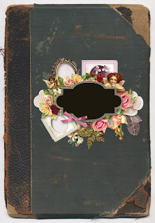
      I spent this evening filming the ending of our video, the 'Scrapbook' scene. This involves a close up of a scrapbook of the couple, the girl's hand laying the necklace onto the page and then closing the book. We made the scrapbook with our ancillary in mind, and decided to make the front cover the same as our album cover, with a different word in the middle - "forever" - which is ironic, as the love doesn't last, going against the conventions of a romance genre. The double page where the necklace is placed includes the same pictures that were stuck on the girl's mirror, making the audience assume she has taken the pictures down (as seen in a previous scene) to make the scrapbook.

      Monday 27 February 2012

      Filming 25/02/12

      We did some more filming today on location at Rachel's house. Here, we filmed most of the 'break up' scenes which we will edit with blue tones to reflect the sadness. We also re-filmed the bedroom scenes (the lighting was too dark last time) which introduce the female protagonist trying on dresses in front of the mirror.

      We included a close up of the necklace in her hand after she's taken it off to connote that the love is over. 
      Over the shoulder shot of the female protagonist trying on dresses.

      Two shot of the couple having an argument.

      Mid shot of male protagonist with a photograph of the couple in the foreground, connoting that he's thinking about the relationship.

      Monday 20 February 2012

      Rough Cut

      Film editing is part of the creative post-production process of filmmaking, involving the selection and combining of shots into sequences, and ultimately creating a finished motion picture.


      Here's our first rough cut of our video. We watched all of our footage back so far and decided on the best shots to use, and then edited them together roughly, experimenting with different editing techniques such as jump-cuts, fades and montage. We will continue to refine the cut while shooting continues and get audience feedback so we know what to improve on.

      Thursday 16 February 2012

      Filming 15/02/12 - Cafe

      Today we re-visited the cafe we found in Exeter to finish filming the 'meeting' scene, which is a crucial part of our narrative. We used various props as signs for the audience to decode and interpret:


      Diary: The female protagonist is writing in her diary, drawing hearts around the date "14th February" - the preferred reading is that she is a romantic girl, who is longing for love. A negotiated reading could be that she is already in love and is perhaps waiting for her boyfriend as it's Valentines Day.


      'Birdsong' Novel: The female protagonist also reads her book whilst in the cafe, connoting that she is intelligent and again, romantic, as it's a romantic novel. This foreshadows the romance that will blossom throughout the video. 

      This POV shot captures a close up of the page in the novel (we purposely focused on this page because the words reflect the narrative in our video) whilst showing the male protagonist's entering in the background. We practiced this shot in our pre-lim filming which paid off because we were able to film the shot quickly and to the standard we wanted.


      iPod: The male protagonist is listening to his iPod making the film relevant to a modern audience and connoting that he likes music - this also acts as an engima code because it makes the audience question what he's listening to/ what sort of music he likes.

      Tuesday 14 February 2012

      Ancillary: Poster

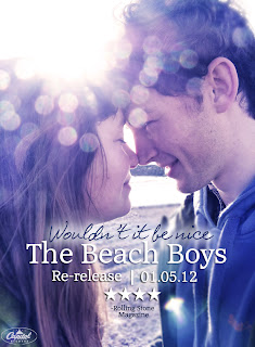
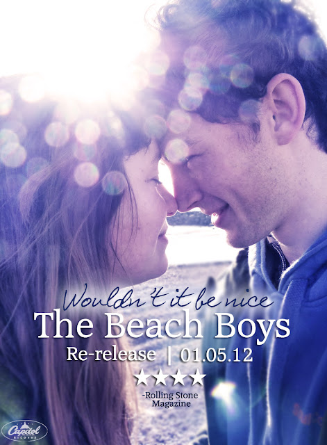
      We decided to take a different route with our ancillary poster, after looking at the film poster for the 'One Day'. We thought that by using a photo of the main protagonists in the video, the audience immediately understand that the music video fits in with the romance genre. 

      Here's a screen shot of the 'One Day' poster alongside our chosen photo. We've edited the photo using the same blue/ sepia tones from the poster, giving it a cinematic feel. This also reflects the blue tones in our video towards the end when the couple break up, thus the poster holds hidden meaning and foreshadows the events that take place in the video.
       
      We added some text, giving information such as the name of the song and artist, the release date and a four star review from 'Rolling Stone' magazine (The Beach Boys were once featured in this magazine so we thought it would be a realistic choice). After showing our audience the poster at this stage, they told us that they couldn't read the text "Wouldn't it be nice", so we added a soft glow around the edge to make it stand out more.
       
      Here is our final ancillary poster. We decided to put "re-release" on it to make the audience aware that this is an old song made relevant to a modern audience. Using house style, we added the Capitol Records logo in the bottom left-hand corner, as we did on our album cover.

      Sunday 12 February 2012

      Ancillary: Album Cover

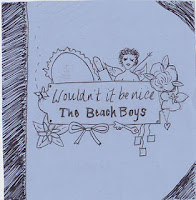
      Below is the draft of our album cover. We followed this when creating our album cover on Photoshop, allowing us to create our product quickly and easily.
      Screenshot showing us editing our first 'mock-up' album cover in Photoshop.
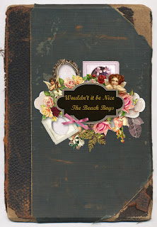
      Our final album cover.
      We took some time experimenting with different fonts for the title. After asking members of our target audience, we came to the decision to have 'Wouldn't it be nice' typed in a handwritten font, and 'The Beach Boys' typed in a more formal font to stand out. We also added a drop shadow on the motif in the middle to give it more definition, which both us and our audience really liked. Finally, we added the logo for 'Capitol Records', the record label that The Beach Boys are signed with.

      Tuesday 7 February 2012

      More Photos

      We have collected some photos of our male and female protagonists to use in the scene towards the end of the video where the girl takes the photos of them together off her mirror and sticks them in a scrapbook.These photos are personal to our actors and convey good times shared by the couple.


      Friday 3 February 2012

      Birdsong

      When filming on loaction in Exeter we accidentally captured a great shot of two birds flying over Hannah and Steve, which was reminiscent of the book we're using as a prop, Birdsong. The book is a romantic war novel, however it relates to our music videos narrative well as it too focuses on the beginning of love/infatuation, happiness of love, and loss of love. 

      There is also a BBC adaptation of the book that we have been watching too. It has given us great inspiration for some shots and editing techniques that we may explore with our music video. Above the BBC trailer is some art work and a theatre poster. This has given us some ideas for our poster and album cover.

      Sunday 29 January 2012

      Album Cover Draft

      Based on our ancillary poster idea of making the background a scrapbook, I've drafted an album cover with a similar theme, as we feel the idea would work better as an album cover. Surrounding the central title, are many symbols of romance and love, such as flowers, cupid and a heart-shaped necklace (featured in our film). The key is a metaphor for love as it connotes opening up and letting somebody into your life. There is also a bow and a mirror which are typically 'girly' objects, contrasting with the title 'The Beach Boys", suggesting that this could be a story about a girl and boy who fall in love. The background would be a mixture of layers such as faded letters and photographs giving it a scrapbook feel. I think that framing the cover with a border also adds to the scrapbook effect.

      Friday 27 January 2012

      Filming 27/01/12

      Today Rachel and I did some more filming in Exeter. We filmed a variety of locations such as:
      - Gandy Street
      - Cathedral Green
      - Cafe
       In each location, we filmed a variety of shots such as follow shots, close-ups, wide shots and two-shots, gaining some great footage! We found a little cafe with a large window looking out onto the high street that's perfect for our beginning scenes where the couple meet. Unfortunately, our camera ran out of battery during the filming of the cafe scenes, so we'll have to go to Exeter again soon to finish them. We captured some lovely shots outside the Cathedral, with the sun reflecting off the wet pavements creating a source of natural bright light, enabling us to capture a silhouette of the couple which is something we wanted to achieve. Overall we are pleased with the progress we made today and look forward to filming more footage!


      Sunday 22 January 2012

      Ancillary Poster Draft

       Rachel found this old book which we thought would make a great background for a scrapbook style poster. This brought us to the decision to start our ancillary poster from scratch, using this book as the background. 
       We then added a vintage-looking ... which we edited in Photoshop.
       
       Finally, we added text to create the title, "Wouldn't it be nice" by The Beach Boys.
      We love the feel of this poster, but feel that perhaps it has more potential to be an album cover rather than a poster. We will continue experimenting with ideas.

      Thursday 19 January 2012

      Update


      We are having to take a break from filming as our actors are studying hard for their exams! We will carry on working on our ancillary tasks during this brief period. 

      Poster: Take 2


      Taking comments on board from our former poster we designed a new one, with our target audience in mind and we were inspired by Michelle Caplan, a collage artist. 

      Ways we have changed our poster to fit:
      • In our music video our female protagonist keeps her memories in a scrapbook which is very personal to her. Me and Rach both have scrapbooks as do many of our friends, thus we know that it's a popular hobby for our target audience. Therefore this poster would draw our audience in because they can relate to it on a personal level. 
      • This poster is a visual representation of the female protagonist's memories, creating enigma because the audience may question why such images have been included on the poster.
      • We used layers in Photoshop to keep the vintage/homely vibe that our audience liked from our previous poster.
      We are planning to included more images that relate to our music video, and alter our poster further depending on audience feedback.